How to be a Curious Consumer of COVID-19 Modeling: 7 Data Science Lessons from ‘Effectiveness of COVID-19 shelter-in-place orders varied by state’ (Feyman Et Al 2020)
You can reach me at @rexdouglass and see some of my other work at rexdouglass.com
WORKING DRAFT: COMMENTS WELCOME!
Acknowledgments: The author wishes to thank Yevgeniy Feyman for suggesting their paper for this review.1 I am also grateful for feedback and corrections from a number of people, particularly Andres Gannon, Thomas Scherer, Marc Jaffrey, and Andrew Gelman.
Introduction
How should non-epidemiologists publicly discuss COVID-19 data and models? I asked this question at the start of the pandemic when law professor Richard Epstein claimed COVID-19 would not be a serious global health threat and that little intervention was required (Douglass 2020). I argued that the high school debate style of the legal tradition did not lend itself to scientific rigor, honesty, or curiosity, and drew some lessons from social science to encourage better empiricism going forward. Four years later, we have tens of thousands of empirical COVID-19 papers from the social sciences, but the state of empiricism has hardly improved. Methodologically weak but seemingly sophisticated techniques are routinely pressed into service to provide answers where the data on hand cannot possibly, mathematically, provide them (Douglass, Scherer, and Gartzke 2020). So now I return again to the question of how we can promote more careful and curious analysis. Specifically, I draw 7 data science lessons for what to do and not do with COVID-19 modeling illustrated with a simple empirical paper on the causal effects of government lockdowns on individual mobility (Feyman et al. 2020). It is my hope the reader can take away practical tips for how they can begin to challenge and interrogate seemingly sophisticated modeling- especially modeling that is obfuscated, vague, or claims more than the underlying evidence can support.
Feyman et al. (2020)
Feyman et al. (2020) ask whether ‘shelter-in-place’ (SIP) orders reduced individual mobility at the start of the COVID-19 pandemic, and if so where and why. It is an important question. Whether and to what degree governments can influence public behavior during an emergency has major ramifications for both pandemic response and broader social policy in general (Herby, Jonung, and Hanke 2023; Prati and Mancini 2021; Wilke et al. 2022; Vaccaro et al. 2021).
It’s also a problem that has methodologically stumped social science due to all of our available historical cases being by definition moments of crisis with complex epidemiological processes interacting with complex political and social processes over time (Tully et al. 2021). When an apartment building catches fire, the residents begin to flee, the government orders an evacuation, and neighbors and emergency personnel all try everything they can, pretty much all simultaneously. No matter how closely we observed a single fire, knowing what would have happened in an alternate universe if any single intervention hadn’t been applied, is a near scientific impossibility.
The paper claims to have a solution for this problem; finding “SIP orders reduced mobility nationally by 12 percentage points (95% CI: -13.1 to -10.9)”2 They specifically argue that their identification strategy allows them to call this association causal; “while policy enactment might be endogenous to pre-policy conditions, our estimates are identified entirely from the discontinuous change that occurs post-enactment.” In their eyes, a state-specific local linear regression discontinuity (RD) identification strategy “mimics randomization and allows us to observe the effects of SIP orders on mobility, since we would not expect counties to change day-to-day in other ways which would impact mobility.”
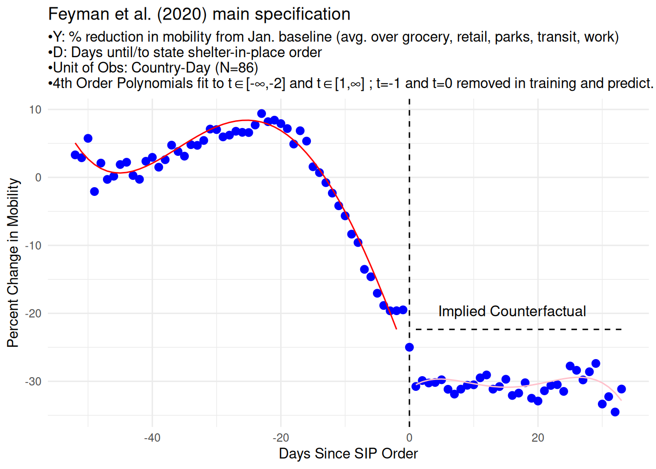
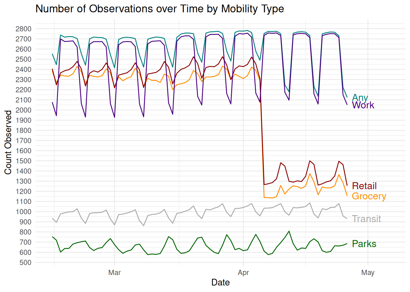
The main evidence provided is an estimated discontinuity in the amount of mobility around the time of SIP orders. Below, I have reproduced Figure 1 from their paper which illustrates the idea. Their data consist of 1,184 American counties (c), observed daily from February 15, 2020 through April 21, 2020 (t), with relative population mobility as measured by Google Community Mobility Reports as the outcome (\(Y_{c,t}\))3, and the date of a state-wide ‘shelter-in-place’ (SIP) order going to effect as the treatment (\(D\)). They take the 39 states that experienced a shelter-in-place order, align their time series so that t=0 is the day of the order, fit a polynomial regression to the points to the left of t=0 and fit a separate polynomial regression to the points to the right of t=0.4 They call the gap between the two polynomial lines at t=0 the “causal effect” of the shelter in place order.
Our two main tasks therefore are:
-To determine whether Feyman et al. (2020) established an association between SIP orders and a 12% average reduction in mobility.
-To determine whether Feyman et al. (2020) established that this association is due to the causal impact of SIP orders on mobility and not some other data generating process.
Lesson 1: You cannot stare at a correlation so hard that it becomes causal
Feyman et al. (2020) argue that there is an angle from which you can view the time series of mobility and announcements of SIP orders where you can see the cause of one on the other. Their strategy amounts to watching an apartment fire very, very, closely. As people flee the building, wait for the moment when the government arrives and announces an evacuation from their loudspeaker outside. If the rate of people leaving in the 2 minutes before the announcement is much smaller than rate of people leaving in the 2 minutes after, then the announcement must have caused the change.
It’s an unusual interpretation of attributable causality. It’s one that’s becoming more popular primarily out of desperation from so many important situations lacking the necessary variation and plausible counterfactuals needed for causal inference (Hausman and Rapson 2018). It attempts to borrow legitimacy by analogy from regression discontinuity design (RDD) strategies that have become popular for similar reasons. In RDD some clever knowledge of the data generating process behind a treatment assignment is leveraged to find a cut point where units just above the cut-point got assigned the treatment (and those below did not) for reasons that are completely unrelated to the data generating process of the main outcome of interest. The analogizing to randomized experiments is irresistible, but “completely unrelated” is doing all of the work in that sentence and in practice many RDD applications exhibit pathologies indicating they fail to meet the required assumptions (Stommes, Aronow, and Sävje 2023).
The extension of RDD ideas to individual time series represents an even more heroic suspension of disbelief and a whole host of new assumptions. It has metastasized an acronym, regression discontinuity in time (RDiT), and hinges on the idea that the data generating process behind when the treatment was assigned is unrelated to the data generating process of the outcome of interest. As before, “completely unrelated” is doing all of the work in the idea, and to what degree that is easy or difficult to achieve is entirely context dependent. Imagine three scenarios:
Experimental Case: An electrical circuit with a switch (\(D\)) and a bulb (\(Y\)). It is in a state of off and we have strong prior beliefs that it will remain in that state of off.5 We pick a time (\(T\)), to flip the switch (\(T→D\)), and pick it carefully by random lottery (\(Z↛T\); \(Y↛T\); \(Y↛D\)). When we watch the oscilloscope traces, we can see a very clear single discontinuity at the scale of seconds, microseconds, and even nanoseconds (\(D→Y\)).6 The smaller our window the less likely are our beliefs that some other event occurred exactly in our a randomly chosen window and it was probably cause by us (\(Z↛Y\)).
Natural Experiment Case: An engine (\(D\)) propels a car at a speed (\(Y\)) of 100 miles per hour. At a time not chosen by the researcher (\(T\)) the engine turns off (\(T→D\)) and the speed of the car instantaneously drops to zero (\(D→Y\)). If the speeding caused the failure, then the path from (\(Y→D\)) is open and all we know is both varied together.
If the cause of the failure was mechanical wear, and so the exact second of the failure is plausibly unrelated to things that are related to speed (\(Z↛T\)), then there may be some small enough window where speed caused the overall outcome but did not cause the specific initiation of the failure (\(Y↛T\)). Again, the smaller that window the less likely something else bad happened at that exact moment in time (\(Z↛Y\)).
If \(T\) was chosen not by mechanical wear but by some other data generating process that is related to the data generating process of speed then this strategy would fail. Consider instead if the car drove into a wall at 100 miles an hour, killing the engine (\(Z→D\)) and reducing the speed to zero (\(Z→Y\)). No matter how small a window we choose, the effect \(D→Y\) will be confounded by another cause which impacted both the treatment and outcome at the same time.
The identification strategy alone does not tell us which world we’re in. Closing those paths, \(Z→T\), \(Z→D\), \(Z→Y\), has to be done either by the researcher’s very strong beliefs/assumption or by explicitly controlling for it with additional components to the design. The modeler has to make a detailed case for what exactly the data generating proceesses are for both \(T\) and \(Y\) how they’re unrelated in a small window.
Observational Case - SIP Orders and Mobility: The data generating processes that Feyman et al. (2020) investigate are closer to a standard observational interrupted time series setup than either the experimental or natural experimental cases above. Their outcome is mobility (Y). Their treatment is the initiation of a SIP order (D). The data generating process for the timing of SIP orders (T) and the data generating process for mobility are very complicated, highly related, and share many common causes.
The single largest source of variation in the system was the DEADLY PANDEMIC that started right around the beginning of their panel. The effects were catastrophic and should be expected to have had first, second, and third order effects through the entire social, economic, and political causal graph (Mellon 2023). The data show a very clear massive downward trend starting around March 15th (\(Z→Y\)), coming on the heels of the World Health Organization declaring the pandemic on March 11, schools and universities closing, the major sports suspending their seasons, etc.
The DEADLY PANDEMIC was also the single largest source of variation behind the timing of SIP orders. SIPs were all issued in a very short amount of time between March 19th and April 7th. States with larger populations, more Democratic politics, bigger budgets, higher exposure and proximity to known outbreaks, etc. tended to issue SIPs earlier in that short window. So against the backdrop of this massive, national, citizen driven, reduction in mobility starting around March 15th, you have states playing chicken with each other and getting in line roughly rank ordered by every major covariate that might impact policy (\(Z→T\)).
There are many other violations of the required assumptions worth quickly mentioning:
SIP orders impacted mobility (\(D→Y_{t>=0}\)), but also so did the anticipation of SIP orders (\(D→Y_{t<0}\)). An order was typically announced at least a day early, it usually came days to a week after intermediate orders closing essential businesses and schools, counties and cities often acted faster issuing local SIPs with state governments following suit, and neighboring states were all shutting down at about the same time.
The Google Mobility Data they use are mechanically not comparable day-to-day, all seven days use a different pre-pandemic baseline, opening another path from \(Z→Y\). There is also systematic missingness with different types of mobility falling out of their overall average day-to-day, and even a third of counties disappearing altogether day-to-day (\(Z→Y\)).
There’s serial correlation with activities earlier in any window being related to activities later (\(Y_i→Y_j\)), e.g. going to the office or grocery before it’s closed to you, moving meetings around, etc. Some aspects of human activity are just inelastic, and can’t be turned off on a moment’s notice. Others are self perpetuating, people see fewer heads in the office and become less likely to come in the next day, etc.
There’s also expected heterogeneous treatment effects over time (\(D→Y_{i}≠D→Y_{j}\)). They’re quick to point out that the day of the announcement might have weaker effects than the day after, and it might take time to come into full effect.
Choosing an increasingly small window around the date of the enactment of a SIP does nothing to fully disentangle these two related data generating processes or their severe autocorrelation. Each day at the beginning of a DEADLY PANDEMIC is fundamentally worse in some ways than the days that came before it. There’s no reason to expect either mobility or politics to be a perfectly smooth function of just one or two observables.7 If a SIP hasn’t yet been issued by Monday, the pressures to do so are even greater by Tuesday. The steady trickle of SIP orders each day from least to most recalcitrant states is a testament to that fact as the severity of the pandemic and resulting political pressure worsened each day.
Compared to the car stopping natural experiment above, their design is not at all like the random mechanical failure and very much like the whole country hitting a wall at 100 miles an hour. In fact it’s very surprising to see SIP orders discussed as an individual treatment at all. You typically see a single ordinal measure of overall policy intervention estimated by seeing how far up the severity of response ladder the government went during this short period (Kubinec et al. 2021).
A SIP order is the last in a long line of increasingly severe steps that governments took to turn off their states, like finally pressing the power button on the computer after closing all your programs and telling Windows to shutdown. It’s much more natural to model this as how long did it take a given state to go from normal 100% on to a 60% minimal power mode. Some states turned off quickly, others took longer. In every case if you see a SIP, you know you’ve hit the floor. It didn’t cause the floor.8
Lesson 2: Make sure the modeling is fully computationally reproducible
There is always a gap between the scientific steps that were actually taken and the natural language write-up that becomes a final published paper. In social science that standard has started to become “computational reproducibility” which typically means the authors deposit code and when someone else runs that code it produces figures that match the ones in the submitted paper (Brodeur et al. 2024). For example, Feyman et al. (2020) deposited code and data with the journal,9 but that code and data cannot fully recreate the paper they submitted. Specifically, they omitted the cleaning code for county-level policies AND accidentally omitted the resulting dataset “county_policies.dta” from the repo. I also ran into errors rerunning their main analysis for a few of the individual states, but this may be just due to a difference between the STATA and R versions of rdrobust.10 For these reasons I’m going to stick to the primary analysis which I’m confident does replicate exactly.
There is also a higher standard of computational reproducibility though which is not typically checked by anyone, which is does the code do what the paper says it does. For instance, the paper casually mentions a decision to create a “washout period.” They don’t want to include t=0 in the treatment group in the RDD specification because orders typically came into effect at the end of the day and not the start. So they say that they’re going to drop t=0 from the analysis.
Our key predictor of interest was the number of days, positive or negative, relative to SIP implementation. While SIP orders sometimes took effect at midnight (13), their effects on mobility may be delayed. In addition, when assessing other policies, there may be expectation of enactment. SIP orders, however, appear to have been announced with little to no delay between announcement and enactment [9]. Thus the announcement of these orders were associated with spikes in mobility as residents rushed to stock up on essential goods [10]. To account for this, and to capture actual response to the SIP order (rather than noise) we allowed for a one-day washout period. We thus dropped observations on the day of implementation.
However when we look at the code, they don’t drop just t=0 from the analysis, they also drop t=-1, the day before the treatment:
//setup washout period
cap drop days_since_sip_alt
gen days_since_sip_alt=days_since_sip
replace days_since_sip_alt=. if (days_since_sip_alt==-1|days_since_sip_alt==0)
replace days_since_sip_alt=days_since_sip_alt+1 if days_since_sip_alt<=0
They also don’t just set \(Y\) to NA for that day, they edit the time indexes so the model now compares real life t=-2 to real life t+1 and pretends the intervening two days never took place. An instantaneous Twilight Zone time skip. Not only does this not match the text, it generates many substantive questions for just what exactly it is they’re claiming to estimate.
Lesson 3: Don’t make physically impossible comparisons
In the garden of forking paths sense (Gelman and Loken 2013), Feyman et al. (2020) makes the odd and poorly documented decision to clip t=0 and t=-1 from the time series instead of something more reasonable like setting the outcome to NA or fuzzing the date of the treatment. Substantively, it is literally a time warp from t-2 to t+1 which is then interpreted literally as the ‘causal effect’ of what happened on the original missing t=0 day. One possible reason for this decisions is that rdrobust can’t handle missingness.11 Concerns about measurement imprecision of what exact hour the treatment should be considered in effect, or concerns about anticipation effects, could have been handled through modeling directly. But instead the quickest computation fix was to perform extraordinary rendition on 72 hours of space-time and sew the timeline back together at the frayed ends.12
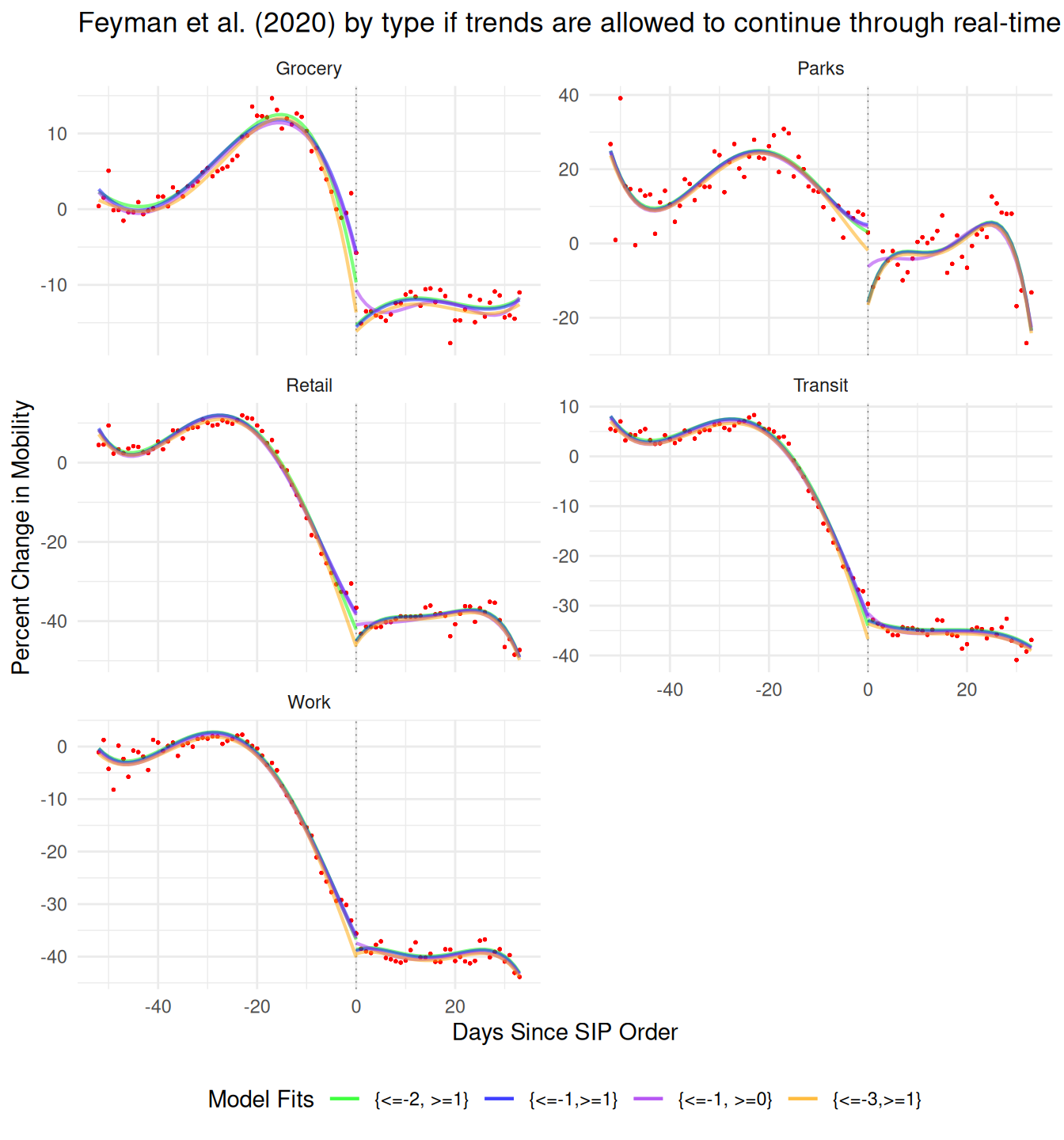
Of all the options available, Twilight Zoning away those two days by just changing the time indexes is the least theoretically defensible one. To understand why, imagine some other physical process that, like mobility, is changing over time. Like a ball falling from a height to the floor. You watch a YouTube video of the ball falling and everything seems normal, but then the editor clips three seconds (two observations) from the middle. The acceleration for the first half of the video will be a smooth \(9.81 m/s^2\), then suddenly the ball will appear to have an instantaneous speed of \(44 m/s\) as it teleports 132 meters.
I’ve produced three plots below for different modeling choices based on that physics example of a ball falling from a height. In the bottom panel, I plot the choice used in the paper of ignoring two measured time points, three full time steps worth the time. I fit a 4th-order polynomial on either side of the treatment window, not including those points in training, and also not including those points in prediction. That mechanically creates a gap in a smooth process which the paper then interprets as their causal effect. The middle panel shows a more defensible choice, where we exclude the points we have uncertainty about only from training, but include them during prediction. Because both trends are well defined by a polynomial, the prediction matches up exactly what would have happened if those time steps had been allowed to take place. Finally in the top panel I show the simplest case where the full time period is allowed to be in both training and prediction which fits perfectly to the real data generating process and the observed path of the ball.
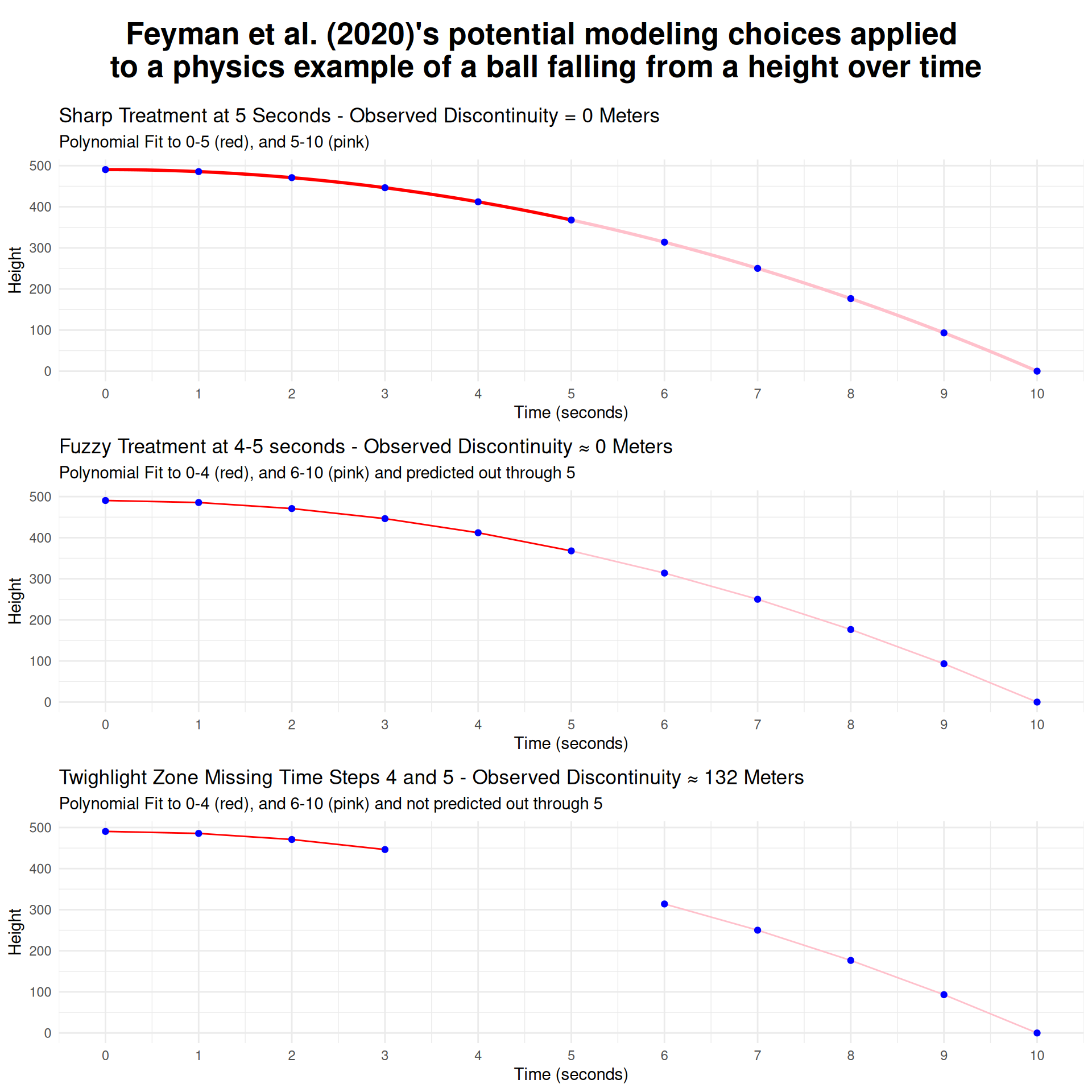
This simple exercise illustrates a couple of important conceptual ideas. First, time is not a cause (Beck 2010). It is a unit of analysis. People (or objects) are moving and we’re taking measurements at intervals. The frequency with which we take those measurements isn’t part of the data generating process we’re observing. Instead, those people (or objects) are having forces act on them and they are responding, and their response unfolds at rates determined by other physical processes, e.g. inertia. If you clip two time steps while observing any process that’s occurring over time, you must account for the fact that that time still happened in the real world. Just because you didn’t observe it doesn’t mean it didn’t happen.13
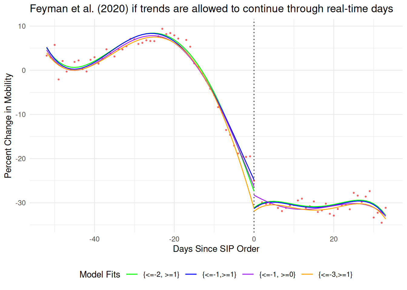
Later I will show that we shouldn’t believe the aggregate measure used as their outcome at all, but for now it is worth quickly illustrating how their primary fit changes under these different assumptions. Their preferred choice of Twilight Zoning away two days, compares t-2 to t+1 and finds a -12.35% gap. If you correct the code to match the text of the paper and compare t=-1 to t=+1 the gap shrinks slightly to -12.05%.
In the figure below I show four additional options based around not removing the physical space-time but just setting the outcome to NA and letting the model predict the trends into t=0. If you stop at the point used in the paper’s code, t=-2 and t+1, the predicted gap at t=0 shrinks to -3.7% (green). If you stop training at the points described in the paper’s text, t=-1 and t+1 the gap still shrinks but only to half as much at -6.5% (blue). By including the day before where anticipatory effects may have temporarily leveled off the decline in mobility they get an extra bit of gap from the pre-trend. If you include the day of the treatment like a regular sharp discontinuity design, the gap shrinks even more to -1.9% (purple). And finally, if you’re worried about anticipatory effects (Hausman and Rapson 2018; Barreca et al. 2011), and remove not just the day before as they do but two days before, the gap disappears entirely to 0.6%.14 This exercise of checking sensitivity to individual data points isn’t optional, and a lot of dubious RDD results are entirely due to overfitting with awkward polynomial regressions (Gelman and Zelizer 2015).
Lesson 4: Make sure the outcome measures what you say it does
The dependent variable is county-day mobility proxied for by Google’s Community Mobility Reports. There are no summary statistics in either the paper or replication material. A common theme of social science work that leans heavily on their identification strategy for credibility is that they will spend very little attention to measurement. Here is the entirety of the description of the DV in the text:
We first obtained daily changes in population mobility from Google Community Mobility Reports for February 15, 2020 through April 21, 2020. These reports contain aggregated, anonymized data from Android cellphone users who have turned on location tracking. Daily mobility statistics are presented for all U.S. counties, unless the data do not meet Google’s quality and privacy thresholds [5]. We did not exclude any additional counties. Our analytic sample included 128,856 county-day observations, accounting for 1,184 counties and 125.3 million individuals.
They key outcome in our analysis was changes in population-level mobility. Our data include the number of visits and time spent at various locations such as grocery stores or workplaces. Mobility is reported as the percent change relative to a median baseline value for the corresponding day of the week during Jan 3–Feb 6, 2020 [5]. We then computed an index measure by taking the mean of percent changes for all non-residential categories which included: retail and recreation, groceries and pharmacies, parks, transit stations, and workplaces.
Second, it is unclear whether the Android users who contribute data to Google Community Mobility Reports are representative of individuals living in that county. Unfortunately, this information is unavailable. Indeed, there are observed demographic differences between Android and iPhone users across age groups and gender [29]. To the extent they are different, our results may not generalize to other individuals.
There’s nothing else to go on for either the validity of this proxy or how it was measured in this specific panel. Their description of the mobility measure is in several ways incorrect. First, it’s not based on the number of visits and time spent, the five categories they include Retail, Grocery, Parks, Transit, and Work are based on the number of visitors on a given day. The sixth category, residential, measures time spent at home, but they do not include it in their analysis.15
Further, the data do not include the ‘number’ of visitors, Google only provides a normalized percent change and that normalization scheme is so complicated and relevant that Google’s description of their own data is worth quoting at length.
The data shows how visitors to (or time spent in) categorized places change compared to our baseline days. A baseline day represents a normal value for that day of the week. The baseline day is the median value from the 5‑week period Jan 3 – Feb 6, 2020. For each region-category, the baseline isn’t a single value—it’s 7 individual values. The same number of visitors on 2 different days of the week, result in different percentage changes. So, we recommend the following: Don’t infer that larger changes mean more visitors or smaller changes mean less visitors. Avoid comparing day-to-day changes. Especially weekends with weekdays.
The data providers directly say the data are not appropriate for fine-grained day-to-day comparisons, and the paper’s identification strategy hinges entirely on being able to make very highly precise comparisons on either side of a specific day.16
To be concrete, Google took all the Mondays between Jan 3 and Feb 6, 2020, found the median number of visitors to grocery stories to be say 200. For a new Monday in our window from February 15, 2020 through April 21, 2020, they saw 100 visitors they report a percent difference of -50% from that original 200 baseline. They then repeated the procedure separately for Tuesdays, Wednesdays, etc. If fewer people tended to go the grocery on Tuesdays and it ended up with a smaller baseline of a 100 then seeing 100 people later in our panel would be considered a -0% change in mobility.
Ratios are just two chances to be wrong, and so an observed change between any two days might either be fewer people going out or the same number of people going out but on a traditionally slower day.
This isn’t a big deal unless the identification strategy hinges entirely on being able to make very precise comparisons of two consecutive days. Then it’s a huge deal. A SIP order announced on Friday is going to mechanically have a different amount of mobility reported on Thursday and Saturday even if the exact same number of people went out. This problem hits especially hard for low volume activities like going to the park where day-to-day swings from small numbers in the numerator and changing baselines in the denominator lead to massive (-50%, +50%) swings in mobility day-to-day.
Lesson 5: Don’t ignore systematic missingness
The paper doesn’t say anything about missingness at all except for the single ominous line- “Daily mobility statistics are presented for all U.S. counties, unless the data do not meet Google’s quality and privacy thresholds.” What does that mean? Google’s documentation says that missingness could be due either to lack of collection on their end or intentional censorship due to privacy concerns. When there were too few visitors below some threshold that day, e.g. the 5 at the park for a small county, rather than calculate the large drop in mobility, they censored the observation entirely, while allowing similar percentage changes through in larger counties just because there were mechanically more people there.17
We should then expect very weird structural patterns of missingness based on the documentation alone, and that is exactly what we find in the data. The full Google data set in the replication file has n=190,211 spanning between February 15, 2020, to April 26, 2020. Rectangularizing the data so that counties that have complete missingness still appear in the data as NAs brings the total to n=202,968. Overall missingness is high, only 37,070 (18%) of county-days are complete with no missingness in any of the 5 individual mobility components.
Different components exhibit different levels of missingness; Parks (75% missing), Transit (62%), Grocery (24%), Retail (21%), and Work (5%). These roughly correspond to how many of each of these types of points exist and how many visitors they might have in a given day. Only the most populous counties might regularly clear the censorship threshold for parks, but both large and small counties still had most people going to many places of work. Rather than deal with each of these types separately, their main specification simply averages over all 5 types ignoring missingness altogether. Below is the STATA command which creates their average index.
//create average mobility
egen mean_mobile=rowmean(retail_and_recreation_percent_ch grocery_and_pharmacy_percent_cha parks_percent_change_from_baseli transit_stations_percent_change_ workplaces_percent_change_from_b)
Since their measure then really isn’t overall mobility, but an average over a portfolio of individual mobility types, it begs the question- how might that portfolio differ between counties or within counties over time if there is so much overall missingness and individual components might drop in and out? Might that missingness be structural between counties or within counties over time? Below is the count of available types by county-day for the whole panel sorted from top to bottom by least to most missingness.
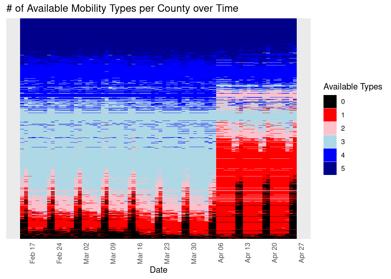
The pannel’s missingness is in fact not as if it was missing at random (MAR).18 There’s systematic missingness across different kinds of counties. There’s systematic missingness that gets worse over time across the entire timespan of the panel. There’s systematic missingness within units over time. There’s clear vertical banding where some types of mobility are missing on cycles, e.g. weekends, but only sometimes and only for some counties. There’s a massive dropout in mobility measures right at the time of the treatment for most units.
Again this isn’t a huge deal unless you are naively averaging over these five different measurements, and need the same units to be present both just before and just after an arbitrary cutpoint. Then it’s a huge deal.
As important as this is, it is not surprising this missingness issue was missed. It is a common problem, especially among work using weak statistical software, e.g. STATA, jupyter notebooks19, etc. When software makes exploratory data analysis obnoxious to perform, authors rarely do the necessary due diligence before jumping right into their main analysis.
How exactly are these individual mobility types getting mixed and remixed arbitrarily over time and across different kinds of units? Below is the count of observations by mobility type over time. First, there’s a strong weekend cycle where the number of counties in the data cycles by several thousand at first and then by almost ten thousand by the end of the panel. So which counties are even present in the data could literally be different from just before to just after a SIP announcement (a quarter of the panel disappearing or reappearing). Second, which types of mobility drop off and when varies, so even if a county is measured through the full period, its average mobility will still be some weird varying mixture that changes day-to-day. Third, and most obviously, Retail and Parks observations nose dive to only a third of their availability right around the time we’re most interested in, making the post-treatment portfolio not comparable to the pre-treatment portfolio for two-thirds of the sample.
I don’t actually know how the stated identification strategy can be salvaged with this data. The closest strategy I can imagine is as follows. First, get rid of the constantly changing mix of different types of mobility. At a minimum, always disaggregate the mobility types, but also probably just focus on one like work as it’s the only type that’s consistently available for most counties for most of the time period. Next, subset to the counties that are large enough that they don’t drop out on weekends if we’re focused on just a few day-to-day changes. Going forward I present both the full panel (solid line) and the suggested subset of only county-mobility types that are present for all 72 days (dotted line).
Lesson 6: Don’t aggregate things that shouldn’t be aggregated
Next we start to plot raw values of mobility and you can immediately see why you should not naively average 5 different pre-normalized time trends. For starters, each type of mobility has a very different temporal trend, probably because they each have a very different data generating process. Work for example is perfectly flat right up until around March 15th before declining to about -40% levels. Work schedules are typically rigid and is an activity involving most of the population, so the difference from the baseline period is nearly zero with very little day-to-day variance. Contrast that with parks which is a luxury activity performed by a much smaller number of people, so there are massive (+60,-20) swings throughout the period and day-to-day variance is extremely high. Grocery represents yet a third pattern with a spike in activity just prior to March 15th as people stocked up, and then only a modest decline to -20% as people couldn’t really stop shopping for groceries, like they could for retail items which declined to -40%.
The 5 categories also don’t represent equal amounts of all activity. Changes in the behavior of hundreds of millions of people going to work is weighted equally to changes in behavior of hundreds of thousands of people who visit parks. Rather than averaging being helpful by canceling out individual and identically distributed noise, leaving just the true signal, it is actively harmful by smooshing together five different data generating processes into some abomination that doesn’t reflect any of them.20 A naive average fundamentally does not measure the concept of overall mobility that it wants to.
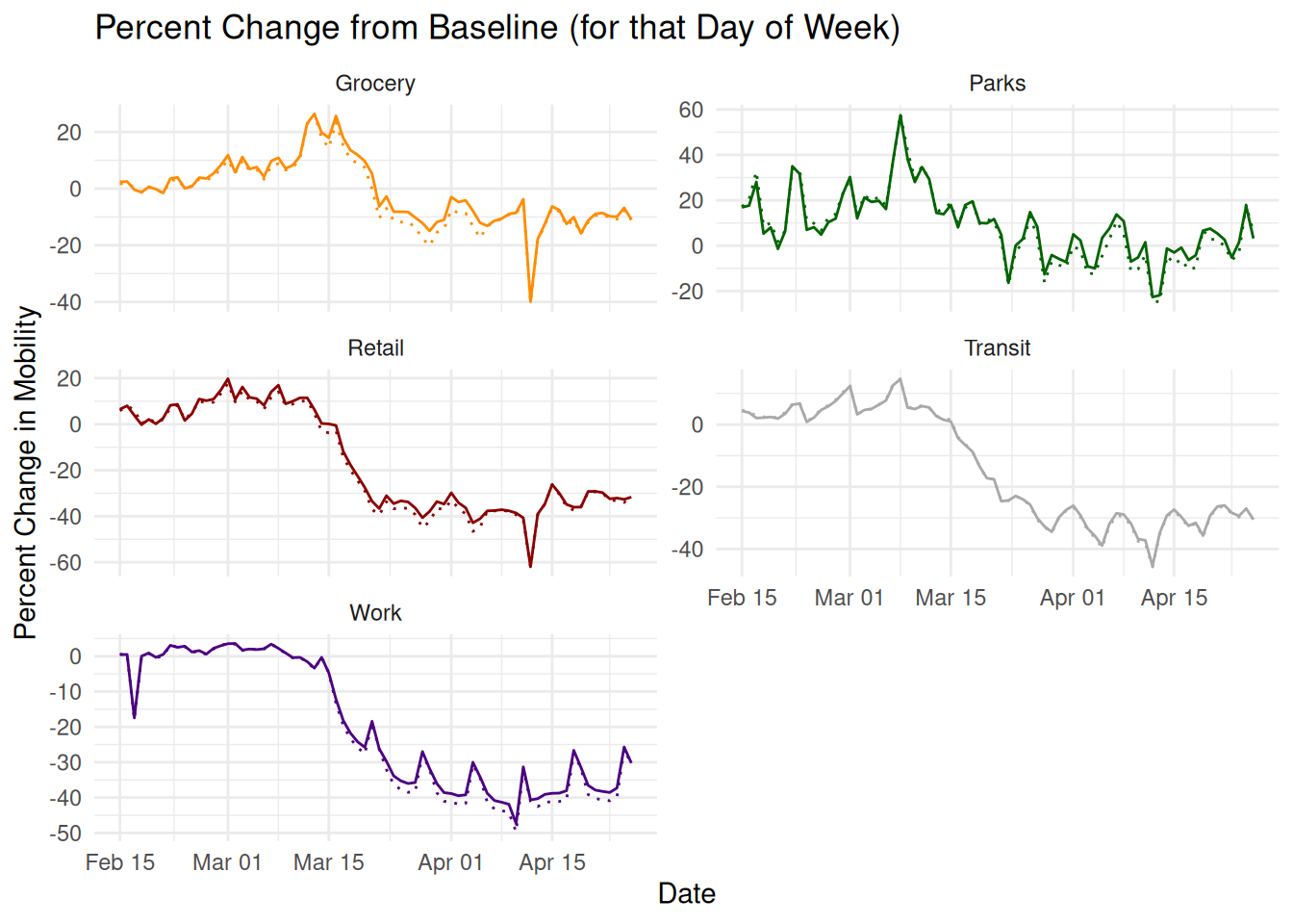
In Supporting Information 1 (SI1)21 they rerun the aggregate result for each mobility measure individually, using the same Twighlight Zone time skip strategy. Let’s reproduce that here in the figure below but instead with the physically plausible formulation that allows those missing days to take place. Here the result becomes much easier to interpret. Under most of the choices for days to include in training for most of the types of mobility, there’s a no obvious discontinuities at all. Work and Transit are perfectly smooth. Grocery and Retail are smooth if you remove the two days of anticipatory spike in mobility as people went out to panic buy. Parks is the only measure with a possible jump around the SIP order under different assumptions. This is the closest to a real world gap in the data, but it’s on the noisiest, least representative measure of mobility, where day to day and week/weekend comparisons across a threshold aren’t valid anyway.
Lesson 7: Verify your result with case studies
Always, always, always, grab a sample of data points and see if they make sense to you based on secondary sources. Let’s do that here for a few states and their SIP orders. Here’s the full description of the treatment found in the main text:
We then identified dates of implementation for state SIP orders from the COVID-19 US State Policy (CUSP) database at Boston University [2]. Changes in state policies are identified and recorded from state government websites, news reports, and other publicly-available sources.
Our key predictor of interest was the number of days, positive or negative, relative to SIP implementation. While SIP orders sometimes took effect at midnight (13), their effects on mobility may be delayed. In addition, when assessing other policies, there may be expectation of enactment. SIP orders, however, appear to have been announced with little to no delay between announcement and enactment [9]. Thus the announcement of these orders were associated with spikes in mobility as residents rushed to stock up on essential goods [10]. To account for this, and to capture actual response to the SIP order (rather than noise) we allowed for a one-day washout period. We thus dropped observations on the day of implementation.
We used the number of days relative to SIP orders as our running variable; e.g. a value of -1 indicates the day immediately preceding SIP implementation, and a value of 1 indicates the first day post-implementation.
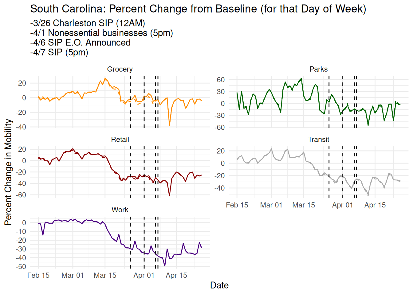
South Carolina is a null case for them where they report no clear discontinuity.22 Here’s their plot from the paper:
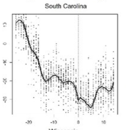
For South Carolina the data set’s date for the SIP order is correct (reporting shows it took effect at 5pm).23 The executive order was announced the day prior and reported in the news, so at least some of the treatment would be experienced in t=-1. More to the point, the final SIP executive order was only part of an entire month of treatments. The week before, the state closed all nonessential businesses which would have had continued treatment effects on the Work component of mobility. Cities acted much earlier than the state, with Charleston24 and Columbia25 issuing stay-at-home orders a week earlier. In none of the mobility trends are there any obvious discontinuities at any of these points.
New York, in contrast, is the poster child for their claim, with a strong precise estimate of a massive -32% reduction in mobility. Here’s their plot from the paper:
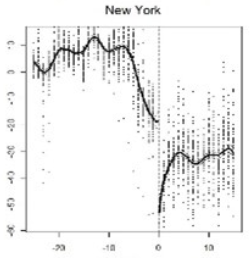
I’m just going to show the SIP order so it’s very clear what happened. The result is almost entirely an artifact of the index being a naive average over disparate time series, in this case, the noisy Parks measure. Parks had a perfectly timed swing from +50% to -50% right at the point of the announcement. It swung back to +50% just after, and oscillated back and forth wildly through the entire panel.
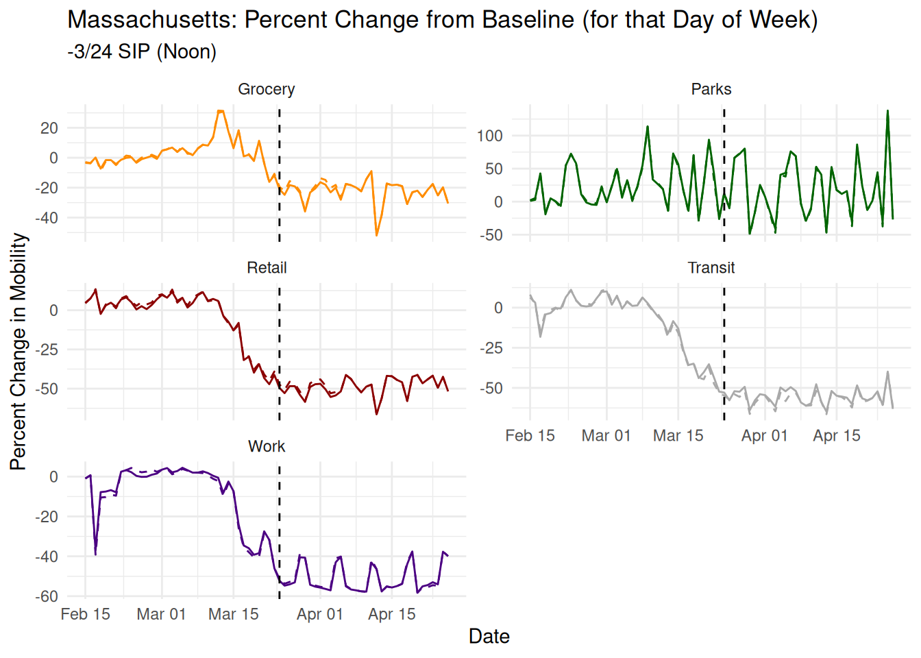
Massachusetts is another poster child for their claim, with a strong precise estimate of a massive -28% reduction in mobility. Here’s their plot from the paper:
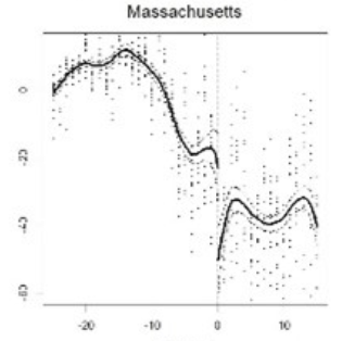
The paper claims a SIP order March 23, 2020 which is the correct date but there’s no mention that the order was actually short of a full SIP, only restricting gatherings of 10 or more. Here again, there are no obvious discontinuities in any of the time trends. There’s an uptick in work the day just before the order, which is part of a saw like pattern seen through the rest of the time series. There’s also the usual suspect of Parks which has a massive +100% swing a couple days before the order and a near 0 just after the order.
That solves the mystery. Their main result is entirely an artifact of averaging things that shouldn’t be averaged, deleting days from literal space-time, and using data that is pre-normalized and not comparable across short time spans to make comparisons across very short spans. Any of the three could mechanically generate the result depending on which combination of arbitrary coding decisions you choose.
Conclusion: The burden is always on the modeler, never the reader
Returning to our main questions, does Feyman et al. (2020) establish a causal relationship between SIP orders and mobility? No. Even on its own terms, the stated identification strategy does not meet the required assumptions, the paper does no work to establish the required machinery, and reasonable beliefs are that those assumptions wouldn’t hold in this case anyway. In general, the proposed causal identification strategy itself is not a strong one. It attempts to borrow the legitimacy of RDD designs by incorrectly treating time as a random source of exogeneity. No matter how hard you stare at a time series correlation, it cannot be made to be causal. Even if you stare really hard at just one spot on that time series. It would be remarkable if you could.
To our other question, does Feyman et al. (2020) establish an association between SIP orders and a 12% reduction in mobility? Also, no. The finding is a hallucination resulting from poor measurement conceptualization. A dataset was used inappropriately, contrary to the guidance of the makers of the dataset, and in a way that would have been obviously absurd at slight visualization. Even if the data had been appropriate for the way it was employed here, very awkward and arbitrary modeling decisions further created an illusion of a discontinuity. Again this should not be surprising. Their argument is effectively that a massive, nation wide, downswing in mobility started to occur around March 15th with many interacting and related causes, of which their favorite of SIP orders came in the middle and more often after. They had to resort to the position that this over-determined process was made slightly faster by their treatment right at the end. Even if it were true, it would have been a miracle to show convincingly in that environment.
More broadly, if someone approaches you in a dark alley with a cute identification strategy, run. They are not here to help. Almost always they have skipped the majority of the first order measurement questions and data due diligence steps because they’re eager to use their publishing cheat code. I’m ashamed to say that very little of anything observational about COVID that came out of the social sciences in the last 4 years is real.26 When the next pandemic comes, we will have to largely torch the work from this decade and start over.
My advice for how to deal with that kind of work is the same for how to deal with people like Epstein and their identical (if less mathy) high school debate tactics. Slow down.27 Do not let an author back you into a corner (Gelman 2022). Don’t let them show you evidence through a keyhole. Don’t let the desire for an answer justify the hallucination of one. The burden of evidence is always, always, always, on the modeler. Never the reader. They are not entitled to a ‘result’ and you are not obligated to remain polite in the face of sophistry.
Instead start from first principles. Ask how you would have approached that question? What due diligence would you have done? If you could imagine a perfect experiment, what would it look like and how does that compare to the research design they’re selling?
At the end of the day, your most important asset is your agency. When you are desperately doing literature review on your phone in a hospital room, you do not want your life or death decisions to be delegated to whatever med student managed to get a bad paper through peer review somewhere on their third try. We spend this time between emergencies researching, critiquing, and understanding the ecosystem of science and technology so that when there is that inevitable emergency, we have the ability to make the best decisions for ourselves and our loved ones.
References
Barreca, Alan I., Melanie Guldi, Jason M. Lindo, and Glen R. Waddell. 2011. “Saving Babies? Revisiting the Effect of Very Low Birth Weight Classification*.” The Quarterly Journal of Economics 126 (4): 2117–23. https://doi.org/10.1093/qje/qjr042.
Beck, Nathaniel. 2010. “Time Is Not A Theoretical Variable.” Political Analysis 18 (3): 293–94. https://doi.org/10.1093/pan/mpq012.
Brodeur, Abel, Derek Mikola, Nikolai Cook, Thomas Brailey, Ryan Briggs, Alexandra de Gendre, Yannick Dupraz, et al. 2024. “Mass Reproducibility and Replicability: A New Hope.” {{I4R Discussion Paper Series}} 107. The Institute for Replication (I4R).
Calonico, Sebastian, Matias D. Cattaneo, Max H. Farrell, and Rocío Titiunik. 2017. “Rdrobust: Software for Regression-discontinuity Designs.” The Stata Journal 17 (2): 372–404. https://doi.org/10.1177/1536867X1701700208.
Calonico, Sebastian, Matias D. Cattaneo, and Rocio Titiunik. 2015. “Rdrobust: An R Package for Robust Nonparametric Inference in Regression-Discontinuity Designs.” R J. 7 (1): 38.
Douglass, Rex W. 2020. “How to Be Curious Instead of Contrarian about COVID-19: Eight Data Science Lessons from Coronavirus Perspective.”
Douglass, Rex W., Thomas Leo Scherer, and Erik Gartzke. 2020. “The Data Science of COVID-19 Spread: Some Troubling Current and Future Trends.” Peace Economics, Peace Science and Public Policy 26 (3). https://doi.org/10.1515/peps-2020-0053.
Feyman, Yevgeniy, Jacob Bor, Julia Raifman, and Kevin N. Griffith. 2020. “Effectiveness of COVID-19 Shelter-in-Place Orders Varied by State.” PLOS ONE 15 (12): e0245008. https://doi.org/10.1371/journal.pone.0245008.
Feynman, Richard. 1974. “Cargo Cult Science.” Engineering & Science 37 (7): 10–13.
Gelman, Andrew. 2022. “Criticism as Asynchronous Collaboration: An Example from Social Science Research.” Stat 11 (1): e464. https://doi.org/10.1002/sta4.464.
Gelman, Andrew, and Eric Loken. 2013. “The Garden of Forking Paths: Why Multiple Comparisons Can Be a Problem, Even When There Is No ‘Fishing Expedition’ or ‘p-Hacking’ and the Research Hypothesis Was Posited Ahead of Time,” November.
Gelman, Andrew, and Adam Zelizer. 2015. “Evidence on the Deleterious Impact of Sustained Use of Polynomial Regression on Causal Inference.” Research & Politics 2 (1): 205316801556983. https://doi.org/10.1177/2053168015569830.
Hausman, Catherine, and David S. Rapson. 2018. “Regression Discontinuity in Time: Considerations for Empirical Applications.” Annual Review of Resource Economics 10 (Volume 10, 2018): 533–52. https://doi.org/10.1146/annurev-resource-121517-033306.
Herby, Jonas, Lars Jonung, and Steve H. Hanke. 2023. “A Systematic Literature Review and Meta-Analysis of the Effects of Lockdowns on COVID-19 Mortality II.” medRxiv. https://doi.org/10.1101/2023.08.30.23294845.
Kubinec, Robert, Joan Barceló, Rafael Goldszmidt, Vanja Grujic, Timothy Model, Caress Schenk, Cindy Cheng, Thomas Hale, Allison Spencer Hartnett, and Luca Messerschmidt. 2021. “Cross-National Measures of the Intensity of COVID-19 Public Health Policies.” SocArXiv. May 1.
Mellon, Jonathan. 2023. “Rain, Rain, Go Away: 195 Potential Exclusion-Restriction Violations for Studies Using Weather as an Instrumental Variable.” Available at SSRN 3715610.
Prati, Gabriele, and Anthony D. Mancini. 2021. “The Psychological Impact of COVID-19 Pandemic Lockdowns: A Review and Meta-Analysis of Longitudinal Studies and Natural Experiments.” Psychological Medicine 51 (2): 201–11. https://doi.org/10.1017/S0033291721000015.
Stommes, Drew, P. M. Aronow, and Fredrik Sävje. 2023. “On the Reliability of Published Findings Using the Regression Discontinuity Design in Political Science.” Research & Politics 10 (2): 20531680231166457. https://doi.org/10.1177/20531680231166457.
Tully, Mark A., Laura McMaw, Deepti Adlakha, Neale Blair, Jonny McAneney, Helen McAneney, Christina Carmichael, Conor Cunningham, Nicola C. Armstrong, and Lee Smith. 2021. “The Effect of Different COVID-19 Public Health Restrictions on Mobility: A Systematic Review.” PLOS ONE 16 (12): e0260919. https://doi.org/10.1371/journal.pone.0260919.
Vaccaro, Christine, Farida Mahmoud, Laila Aboulatta, Basma Aloud, and Sherif Eltonsy. 2021. “The Impact of COVID-19 First Wave National Lockdowns on Perinatal Outcomes: A Rapid Review and Meta-Analysis.” BMC Pregnancy and Childbirth 21 (1): 676. https://doi.org/10.1186/s12884-021-04156-y.
Wilke, Jan, Anna Lina Rahlf, Eszter Füzéki, David A. Groneberg, Luiz Hespanhol, Patrick Mai, Gabriela Martins de Oliveira, et al. 2022. “Physical Activity During Lockdowns Associated with the COVID-19 Pandemic: A Systematic Review and Multilevel Meta-analysis of 173 Studies with 320,636 Participants.” Sports Medicine - Open 8 (1): 125. https://doi.org/10.1186/s40798-022-00515-x.
Footnotes
“This is why you don’t argue with misinformed ‘industry scientists.’ Too many people don’t understand how methods are applied or how to interpret treatment effects. Inability to make specific critiques is usually a red flag”. Yevgeniy Feyman. May 29, 2024. Public correspondence to/about the author. https://x.com/YFeyman/status/1795885873961087318↩︎
The paper makes a number of secondary claims we do not focus on here, e.g. blaming Trump voters for their result being weak.↩︎
The verbatim text reads “They key outcome in our analysis” but I think I know what they meant.↩︎
Their point estimate and confidence interval estimates are based on a local polynomial Regression Discontinuity (RD), fit with the rdrobust package in STATA (Calonico et al. 2017) (replicated by me in R (Calonico, Cattaneo, and Titiunik 2015)).↩︎
We ignore all of the bizarre real world complications of even this toy example like inductive coupling and parasitic capacitance, and just agree to call the bulb off with strong beliefs that it will forever stay off.↩︎
I highly recommend the YouTube channel AlphaPhoenix and his amazing visualizations of current flowing through wires over time (https://youtu.be/2AXv49dDQJw?si=QSY9gjLDhGqZhyUl)↩︎
The paper makes a single argument that rates of cases and deaths were smooth in time and so couldn’t have been the cause of any discontinuity in mobility. Leaving aside that’s just one measurable in an ocean of unmeasurables acting on mobility, there’s also no work done to establish that mobility is caused by cases and deaths, and that the functional form is itself smooth. That work is done purely by unstated assumption.↩︎
Here are some other analogies you can use to think about this. Do the credits rolling at the end of a movie ‘cause’ the movie to end? Does the curtain falling ‘cause’ the play to end? Does being buried in a cemetery ‘cause’ you to die? You’ll get a very sharp discontinuity in mobility there, guaranteed.↩︎
https://doi.org/10.1371/journal.pone.0245008.s008↩︎
There’s really no go to solution for this, commercial software is a nonstarted for replicability. Even on the opensource side, which solution people converge on Packrat, Docker, etc. changes month to month, and still is no guarantee.↩︎
I’m reminded of Feynman’s warning about cargo-cult science (Feynman 1974), and letting our tools lock us into paths of inquiry rather than our inquiry dictating what tools we use.↩︎
I was forbidden from naming this human-centennial-peding.↩︎
If a modeler drops an observation and no one is around to see it, does it still count as significant?↩︎
If they want to rebrand this as an AI based stocking-up detector, there are at least 5 companies that would buy it immediately. Call me.↩︎
“The Residential category shows a change in duration—the other categories measure a change in total visitors.” https://support.google.com/covid19-mobility/answer/9825414?hl=en&ref_topic=9822927&sjid=18168513330628631225-NC↩︎
Oops.↩︎
“You should treat gaps as true unknowns and don’t assume that a gap means places weren’t busy.” https://support.google.com/covid19-mobility/answer/9825414?hl=en&ref_topic=9822927&sjid=18168513330628631225-NC↩︎
The technical term for this pattern of missingness is a “horror show.”↩︎
Pandas and Seaborn are terrible. Fight me.↩︎
This is a form of Simpson’s paradox where the combination doesn’t have to represent one or any of the inputs.↩︎
https://journals.plos.org/plosone/article/file?type=supplementary&id=10.1371/journal.pone.0245008.s004↩︎
“I want to see a negative before I provide you with a positive.” Eldon Tyrell. Blade Runner (1982)↩︎
https://www.cnbc.com/2020/04/06/south-carolina-orders-residents-to-stay-at-home-during-coronavirus-pandemic.html↩︎
https://www.charlestonchamber.org/news/government-relations/city-of-charleston-issues-stay-at-home-order/↩︎
https://www.huschblackwell.com/south-carolina-state-by-state-covid-19-guidance↩︎
“I’ve seen things you people wouldn’t believe.” Roy Batty. Blade Runner (1982).↩︎
Notice I did not get bogged down in the alternate specifications thrown in at the last second as ‘robustness’ checks. The typical response to a critique of main specification is to then start spamming other sets of arbitrary choices where the ‘result’ still appears. They are not the main evidence of the paper, and even that main specification of the paper barely does any work explaining itself. Burying a reviewer in lots of different, vague, poorly thought out specifications to overwhelm them and imply the truth must be in there is a well worn tactic. As Robert Keohane would often say, with a pile this big, there must be a pony in here somewhere.↩︎